Yuckfu Dev Diary #6 – Flat Shading or Textures?

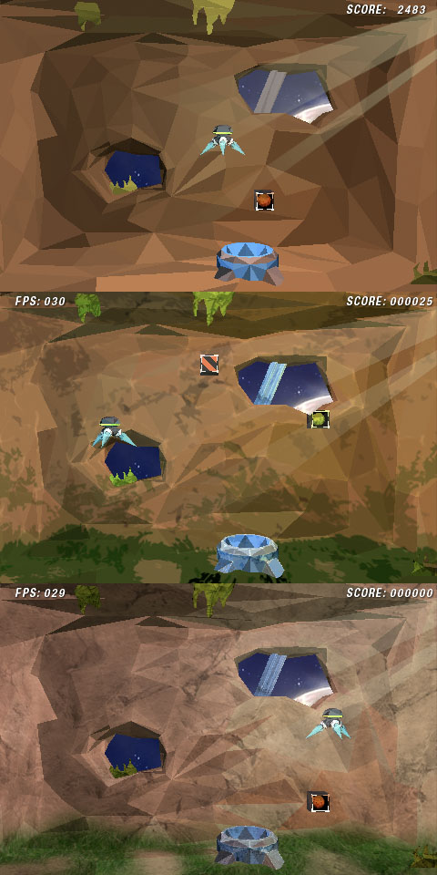
I spent the past few days to create the main graphics for my game. After lots of trail and error, I was quite happy with the flat shaded cave I had created (topmost picture). It did not look realistic in any way, but rather computer generated – which is, as I said earlier, probably not something everyone can enjoy. However, the flat shading worked really nice with the dynamic OpenGL lighting (quite a complicated topic of it’s own), which gives the whole scene some more atmosphere.
When yesterday a friend saw some screenshots of the game, he told me that it looked all well and nice and then asked a very innocent question: “How will you texture the background?” My response was of course “not at all” – I mean, it’s a flat shaded game, right? I turned out that he wasn’t the only one who thought that this flat shading was just an intermediate step towards the final look.

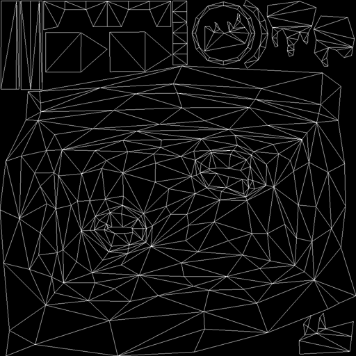
I was initially opposed to using textures at all, but after some discussing, I decided to give a shot. I also unwrapped the whole scene in Wings3D and used Photoshop to slap some colors and textures on it. The second and third screenshot are the results. One with a more comical approach, the other with realistic textures. To be honest – after all this I’m not very satisfied with either one. I don’t even like the flat shading anymore.
Another friend asked me today, why the game is set in this cave in the first place. Wouldn’t it make more sense if you’d collect these boxes in some sort of space hangar? Well, yes… yes actually it would. I’m not sure why I didn’t loose a thought about the overall scenery at all. I just blindly took the very vague cave look from the original game without ever questioning it.
So, I guess I’ll start anew with the background graphics. At least I’m now quite comfortable with Wings3D. It’s a good thing I don’t have a publisher in my neck. Wish me luck!