Is Google’s Chrome Upside Down?
Yesterday Google announced Chrome – Google’s very own web browser. It has numerous very interesting concepts – like the complete process separation of different tabs or the Javascript VM – however, one little seemingly unimportant detail stood out to me: Google Chrome places the tab bar above the address bar and the history buttons. Opera did it this way ever since, while Firefox, Safari and IE7 place the tab-bar beneath the address-bar.
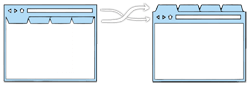
The way Opera and Google Chrome do it certainly makes more sense when you think about to which element the address bar and page controls belong to. When you switch the tab, you also switch the contents of the address bar (the URL) as well as what the history back and forward buttons do. Every tab has its own URL, so it is perfectly logical that every tab should have its own address bar. Likewise, when you press the history forward or back buttons, you are navigating the history for the current tab only. These are not functions that apply globally to the whole browser, so every tab should also have its own page control buttons.
With all that said, Opera’s tab bar placement was the single most important reason why I rather migrated from IE6 (Avant to be precise) to a buggy Firefox Beta instead of to a faster and stable Opera several years ago. Of course my decision was influenced by the fact that I was accustomed to having the address bar on top, but ultimately I really believe placing the tab bar above the address bar is a bad decision from a usability standpoint. I mainly have two reasons for that.
1.) The address bar is unimportant
While writing this article, my mouse cursor is mostly hovering above the textarea in which I’m writing. I also often switch to other tabs to look up stuff. I have the Google Chrome comic, Google’s announcement a thesaurus and a dictionary constantly open. While doing so, I almost don’t use the address bar at all. It is much more important for me, to quickly jump through different tabs, than to open a new page in an existing tab. Furthermore, opening a new tab by double clicking on the tab bar will automatically place my cursor in the address bar. There’s no need to move my the mouse all the way up there manually.
So, because the tab bar is so important and my mouse cursor is 99% of time hovering above the page itself, the tab bar should be placed as close to the page as possible.
Now, there are several things to consider: Admittedly jumping back and forth through the page’s history is also a very important feature. Even more important than switching between tabs I might say. However, I don’t use the browser’s buttons at all. On my PC I use the rocker navigation with my mouse; on the MacBook Air I use the three finger swipe. Also, many new mice have additional (hardware) buttons for navigating the history. The browser’s buttons itself are not as important as their functions. Of course the shortcuts for them are a bit of a “power user” feature, but the web browser often times is the most used application by far, so there are lot’s of potential power users.
Another argument against the tab bar placement beneath the address bar might be, that Google Chrome doesn’t have an address bar. They have something they call Omnibox – it combines the address and search bar of Safari or Firefox into one input box and thereby making it much more important than a normal address bar. But as I said previously, when I open a new tab, my cursor is automatically placed in the Omnibox and I can start typing whatever I search for.
2.) It’s not consistent anyway
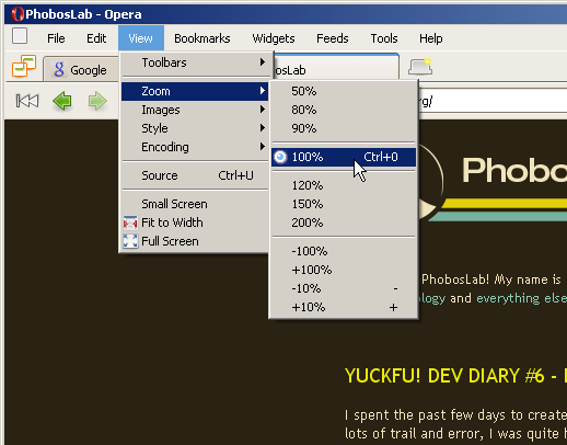
If the address bar and the history forward and back buttons are placed inside the tab like Opera and Google Chrome do it, shouldn’t then all the functions that only apply to the current tab be placed there, too? Opera breaks continuity with several functions that are accessible through the browser’s main menu bar. For instance, I can change the zoom level through the main menu – it is placed well outside of the tab area, yet the function only affects the current tab.
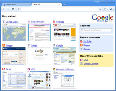
Now, I can only speculate how Google will work around this problem of separating the global (browser affecting) options from the one’s only affecting the current tab. The first screenshots of Google Chrome shows no menu bar at all, however there is a little wrench icon on the right hand side inside the tab. I suspect that behind this icon are the global browser options. So Google might break continuity in the exact opposite way that Opera did.
When you have to break continuity anyway, why not do it in the user friendly way and place the tab bar close the page itself?
Conclusion
Placing the tab bar above the address bar, like Opera and Google Chrome do it, might make the tabbed browsing a bit easier to grasp for Internet novices, but causes confusion with other functions (“I set the zoom to 120%. Why aren’t all tabs bigger now?”). Of course, Safari and Firefox have this problem too, but they have it with every single function. It’s somewhat wrong, but at least it’s consistent.
The gain of placing the tabs close to the page itself quickly outweighs the short learning curve of how the address bar and the history buttons work.