What makes an On-Screen Keyboard Fun?
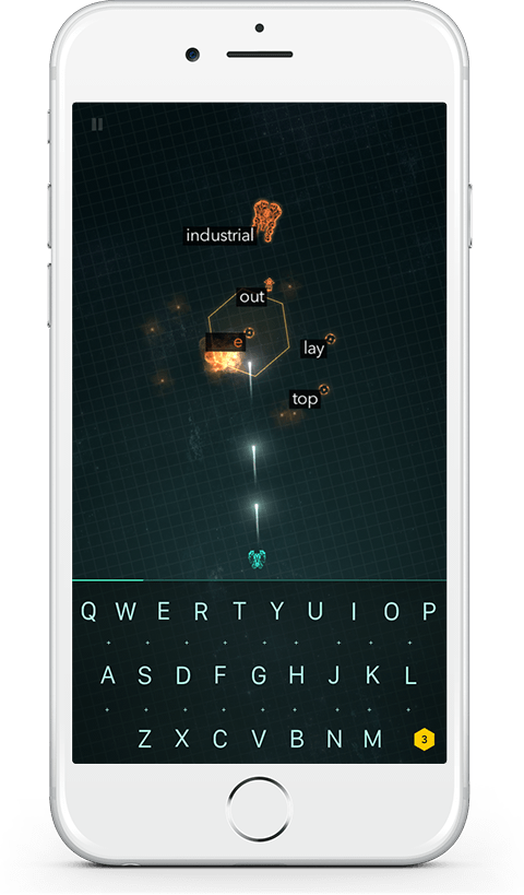
We recently released our typing game ZType for the iPhone and learned a whole lot in the process.
The original Web Version of ZType was hastily created for Mozilla's Game On competition a few years ago and won the Community Choice Award back then. For this version, it was a conscious decission to not care for mobile device. After all, what fun would a typing game be if you don't have a real keyboard?
The Web Version of ZType still remains to be quite popular and we got and more requests for a mobile version of the game. So a few months back we started investigating the possibilities. There are already a few typing games for iOS out there. Many of them can hardly be called a "game" (to be fair, some don't aim to be one), most use the default iOS keyboard and gameplay is cumbersome – sort of what we expected from typing games with an on-screen keyboard.
The default iOS on-screen keyboard needs a lot of screen real estate for things we don't care about: language settings, microphone input, a space bar and word suggestions. Most modern on-screen keyboards are predictive in that they try to figure out what it is you want to write. This works okay-ish for writing a quick SMS, but quickly becomes obstructive for a typing game. It was clear that if we wanted to bring ZType to mobile devices and make it fun to play, we'd have to come up with a custom keyboard solution.
In ZType we carefully control which words appear on the screen. We prevent having two words with the same first letter in the game at the same time, so that targeting words remains unambiguous. With a layout map of a QWERTY keyboard, we can further ensure that these letters spread out over the keyboard, instead of clustering to nearby keys.
Now, here's the crux: if we control which words are on the screen and we ensure keys are spread out over the keyboard, we can enlarge the touch area for each valid key, making it easier to hit the right key. After having targeted a word, there's only one valid key to hit and we can similarly enlarge the touch area for it as well.
We carefully designed the keyboard so that even with those enlarged touch areas, it's still possible to hit all keys. For example, if S is a valid key and thus has a larger touch area, the touch areas for all surrounding keys (W, A, D, X and Y) simply gets a bit smaller. This took some fiddling around and hours of play testing to get right, but in the end was worth it.
Another thing we noticed is that sometimes you hit a key while performing a downward motion with your finger. Typically an on-screen keyboard only emits a letter when you lift your finger from a key, not when you touch it. This allows you to swipe over the keyboard until you see the right key highlighted, but it also creates another problem: Say you want to type the letter T – there's one smooth motion by your thumb, starting from somewhat above the keyboard, then hitting the surface of the touch screen at that T key and continuing to move your thumb further down on the glass before lifting your thumb again. That moment, when you lift your thumb, it may well be over the G key.
The iOS default keyboard seems to recognize this motion and correctly determines that the letter you meant to type was the T, even though you ended up lifting your thumb over the G. In our tests that happened often enough that we had to take care of it too. We ended up detecting if the key where you lifted your finger was held for a period shorter than 30msec and the key where you started the touch was one row above. If both of the conditions are met, we determine that the key you actually wanted to hit was the key were you started the touch at.
The end result is a game where you can almost blindly type on an on-screen keyboard, without being patronised. I'm proud to say that it's actually a fun typing game.
Try it yourself: Download ZType from the AppStore
